Drumroll, Fireworks, Confetti get the marching band ready. It is f-i-n-a-l-l-y here, the big juicy reveal of the smallest space in our house. The one, adult only, colour loving, pattern clashing en-suite.
I’m not embarrassed to say “I love it” but I am embarrassed to say that the journey from taking our dark, narrow, sad and dangerous family bath and turning it into my own personal oasis has taken so long. Scroll down for all the details.
Unless of course you want to read my past blogs “Modern Vintage Jungalow” moodboard blog HERE and “How to make the leap from moodboard to actual design” blog HERE.


My vision, an adult only space where I could retreat, recharge and perhaps pamper myself with a charcoal face mask in peace & quiet is now a somewhat blissful reality. I’m sure you saw this coming but it completely blind sided me like a speeding skoda on a country lane. Oliver has declared it “his fave spot” and I regularly find him in my blissful oasis with his play phone (aka an old TV remote) chatting away to Ryder or Captain Turbot from Pawl Patrol. All I can think is “What is happening?” I guess this is the highest praise, a three year old obsessed with my oasis. (Awkward laugh)
Hold on, step away from the power shower
To truly appreciate how far we’ve come, let’s rewind seven months ago & have a look at the rotten peach BEFORE pics. This is why the space desperately cried out for a revamp.

- Unfriendly layout, ripe for accidents – I’m not a fan of trips to A&E and the old layout was an accident just waiting to happen. The tub was impossible to stand in and even more uncomfortable to sit in. When you stepped out of the tub, there was only 40 cm clearance until you were literally ontop of a radiator. Imagine an active toddler pre-bedtime bath in here. Yikes.
- Lack of light – the space was narrow, dark and sad. Mainly because half of the room had a drop ceiling that held an ancient hot water heater no longer in use. So while the ceilings were 3.4 meters high, half of the space had just 2 meter high. It was simply depressing.
- An odd smell – there had a been a leak in the space at some point and all the wood panelling around the tub was rotten plus big sections along the wall were rotten too. It stunk and even the strongest White Company air freshener and candle couldn’t tackle. Ugh.
- Add in crooked walls, false walls, exposed waste pipes and wow, it was just a miserable space relegated to storage and drying clothes.
Tip: When redesigning a space, identify the big issues or problems with the space first. It’s only natural to jump to the fun stuff like paint colours and fittings – but – making sure the space works is the priority. Otherwise, you’ll have a nice looking space that packed full of those same irritating problems.
The road to a zen like retreat had some bumps
We worked with Thistle Trade Group, the builders who did our main mega renovation. They are fantastic to work with and they know our property. For such a small space, wow, did it create a mess. The main culprit was the change in layout. It meant ripping up the floor to move the water, waste and drains.


Tip: The BEST advice for keeping costs down in a bathroom renovation is to keep everything in the same exact place – this means you don’t move the toilet, the sink, or the tub/shower. Why? Moving soil pipes, waste pipes and water pipes is expensive. It takes time. Time is money.
Another way to blow the budget is to change the access (ie the doorway). In our case we were turning a family bath with a hallway door into our en-suite. That meant closing up the hallway door with that makeshift chevron curtain and punching a BIG hole in our bedroom wall.


Tip: Punching holes in walls means bringing in an architect and/or structural engineer to check if the wall is load bearing (aka holds up the entire house). It usually involves support beams. It takes time to knock down old brick and plaster walls & put up support beams, time is money. In our case, we only needed a concrete plinth (aka that big block of concrete at the top of the new doorway.)
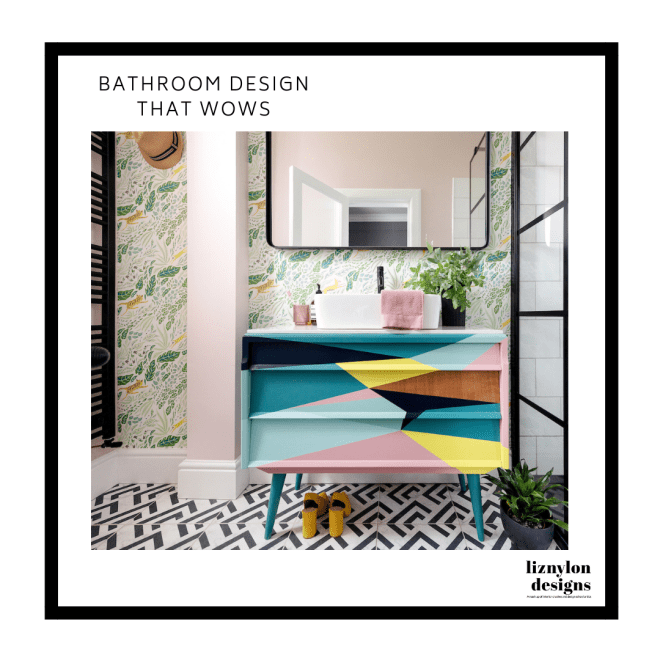
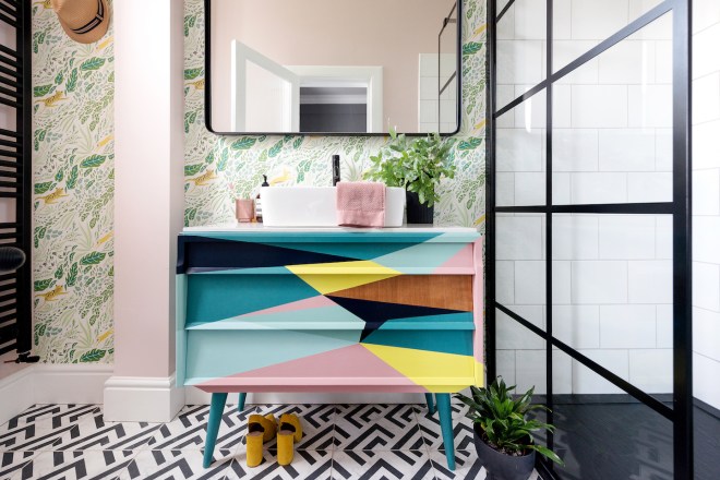
My bright light colourful oasis (aka the after)
This space just makes me smile. Many of you participated in my endless wallpaper polls. So a belated “thank you” is in order. Marcos Navarro, a Spanish artist, designed the fabulously vibrant Persecution wallpaper with punchy greens and endless shades of blue. It is available at Feathr, who champion bold, brave, colourful artist designed wallpapers. It’s wild yet delicate and the perfect inspiration for the colour palette. I’m totally biased & think it looks brilliant.
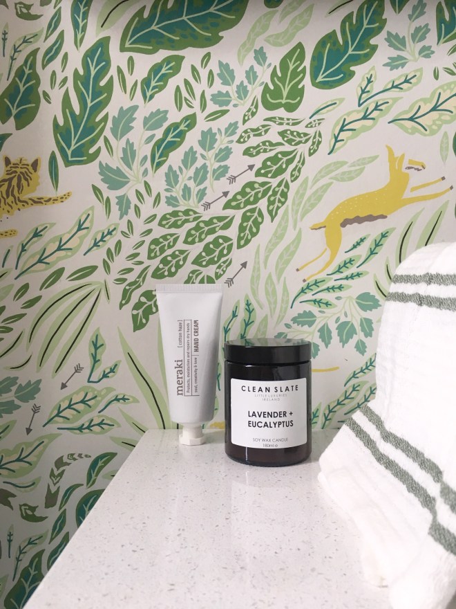
It’s easy to see why I feel pampered with all the luscious details in the wall paper and a few luxe items, this Meraki hand cream available at Lifestory is rich and fragrant while the Clean Slate candle available at IamNomad transports me to past holidays in the south of France. Hand towel is H&M. Oh la la.
The shining star of the space
The upcycled vanity unit certainly adds the unexpected “wow factor” in the space. Fret not, it’s not just a beauty, it’s practical too with loads of storage. In my past blog, I talked all about the collaboration with Happy Retro Furniture who sourced and painted the vintage midcentury dresser. You can read all about it here.
If you are thinking about upcycling a vanity, here are a few helpful tips:
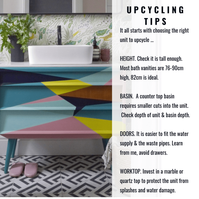
We were limited in space, so I went with a unit that had drawers. This meant each drawer had to be cut to accommodate the water and waste pipes. UGH.

We opted for a budget friendly Victorian Plumbing basin. The slight curve of the basin softens the angles of the vanity. As you can see it consumes the majority of the work surface but we have plenty of space for essentials. This meant I could splurge on the Crosswater MPRO Matte Black faucet and custom Matte Black waste to match.
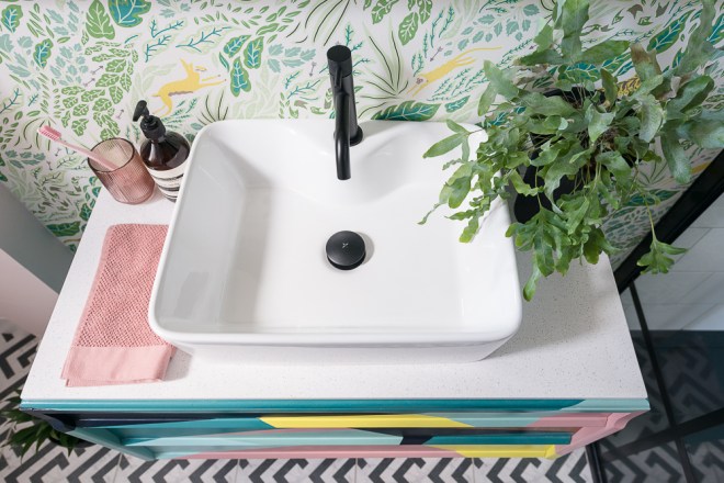
Styling: Some of my favourite things, luxurious Aesop hand soap (just love the smell); H&M Home reeded glass cup in blush; Hay Design perky pink toothbrush at Lifestory; wildly playful plant Dahlia in Edinburgh
The other star in the space
I already take long showers and let’s just say, they are now twice as long thanks to this luxe shower. The Drench Showers Black Frame shower screen is full on dreaminess. This is another area that we splurged. The luxe industrial vibe reminds me of my years in NYC. The frame design is full on runway glamour yet feels durable to withstand hurricane force winds. The frame is made of actual steel dividers.

Add in Tap Warehouse Vellamo rain shower head and instead of a “calgon take me away bath moment”, I have a decadent treat that reminds me of a “Maldives rain storm” from my honeymoon. I know, I deserve an eye roll with that comment.

This is going to come as a shock but beyond the layers of colour and pattern, I secretly lust after Scandi minimalist design. I love the simple clean lines. When I saw this Nichba Design matte black metal bath shelf, hello. It was a “must have” for the industrial monochrome vibe in the shower. Just. How. Sexy. Is. This?
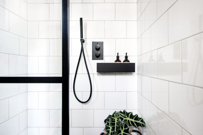
I’m all for making life a bit easier and these two items are total rock stars in design and function. The black shower shelf by Nichba Design is removable, which makes cleaning super easy. yay. The Tap Warehouse Vellamo concealed handheld unit in Matte Black is equally sexy as it is helpful at spraying down the shower walls and plants.
We saved big time by using the most basic white wall tiles from B&Q and we only tiled to just over the shower head at 2.1 meters. The shower space 1200 x 900 x 2100 equates to 9 meters of tiles. Tiling up to the ceiling and using luxe tiles would have imploded our renovation budget.
Tip: We placed the concealed shower controls on the side wall along with the handheld, while the rain shower head is on the other wall (see below). Why? Nothing is worse then having to step into the shower to turn it on & getting drenched in cold water.

See those cute pink leather Bohemia Design slippers? Mother’s Day gift from the boys. They certainly know how to sweeten me up. They are seriously soft and comfy.
Creating some zen in the space
Before the renovation, the first thing you saw from the hallway was the toilet. This drove me crazy mad. Who wants to look at a toilet? So when we moved the doorway, I had a heated debate with hubby on which way the door would hang. I hear ya, real world problems. The toilet is now politely hiding behind our reeded glass door (yup, we kept the same door).


So the corner behind the door has a sexy Matte Black heated towel rail set against the Farrow & Ball Calamine pink wall and the toilet. You can DM me if you really want to see the toilet & I’ll send you a pic.
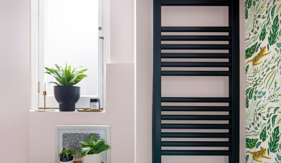
Some of my fave pieces include this House Doctor brass candlestick and Hay Design brass tray from Lifestory, while the H&M Home black ceramic vase has a tribal vibe.
With any renovation, you have to be flexible and unexpected things will pop up. We originally wanted the heated towel rail to sit on the same wall as the hook … but after building a box around the upstairs waste pipe, it didn’t leave us enough space. You can also see the Spark & Bell two armed brass and black wall light literally just fits in the space next to the supersized black metal Maisons du Monde UK mirror.

The details of daily life
I’ll happily admit that I feel like a pampered princess in this space and its not just the mega design details, it is also the little touches that make the space feel special. I’m obsessed with Hay Design and on a recent trip to Lifestory (aka my “go to” Scandi shop in Edinburgh), I treated myself to this mini brass tray and pink toothbrush. The tray is perfect to hold jewellery. Can we also take a second to “oh” and “ah” over the bold monochrome Luka floor tiles from Tile Giant. These are so glam with the faint marble effect.


So there you have it. My colourful oasis. If you have any questions on bathroom renovations, just shout. I’m more than happy to answer anything.
I would also like to say a very special “thank you” to Tile Giant who very kindly gifted the Luka Floor Tiles and Tap Warehouse who were generous and gifted the Vellamo concealed shower system. Everything else was purchased. The design and styling is 100% my own. Every word and opinion in this blog is my own.
I hope you enjoyed the big juicy bathroom reveal. There were lots of ups & downs, zigs & zags, heartaches and joys renovating this small space. In the end, I’d do it all over again.
I’d love to hear your thoughts, leave a comment or ask any question!
Cheers,
Liz xx

Oh Liz great to see the before photos to fully realise how far you’ve taken this space! I think you were right splurging on the details – the Drench shower frame is dreamy but equally your vanity and wallpaper is spot on. A fabulous palette of colours in here, love it 🥰
LikeLike
Absolutely stunning! Curious why you didn’t extend the interior window to either end of the wall above the shower tiles…
Honestly, that is the only (super minor) change I would make, everything else is divine
LikeLike
thank you for featuring my colourful en-suite on your blog
LikeLike