High Five. That’s how I feel after I’ve hit submit on my Interior Design coursework. Yes! I have just one class to go and I’ll be finished my first year of studies. It’s flown by yet at the same time feels a bit of a snail pace. So, what do you think — am I ahead of the game or behind? I’m still feeling inspired & eager to jump into the next class – but – as you can probably guess, sadly behind.
Some may think going to Interior Design school is all about paint swatches, fluffy cushions and mood boards. I’m here to tell you it is so much more. It has exceeded my expectations and required a lot more time and patience than I originally thought was needed. Why? Well, I love design and I’m obsessed about interiors. Since I was a small girl, I’d regularly re-arrange my bedroom tugging furniture from one side of the room to the other and rehang posters. I’ve moved home more times than I can count on fingers and toes, every single time I’ve changed the wall colour, created gallery walls and been on the hunt for furniture. Plus, I’ve renovated four homes. That’s a lot of practical experience. I just have to remind myself that learning new skills takes time. It does.
Learning new skills is like riding a bike (I hope)
This course we dove even deeper into the technical side of Interior Design. It focused on scale drawings, scale elevations, scale furniture plans and rendering (aka colouring). These are all must have skills as a designer. Before you start to laugh, technical colouring is a lot harder than it looks. I consider myself a doodle master and always have coloured pencils, crayons & sharpie pens within arms reach. Wow, was it an eye opener. HA!
Each course includes video lectures, course materials, assignments and recommended reading (aka books). If you are thinking about studying, here is an idea of the books I read for this course:
Architects Pocket Book. It’s packed full of all the things you didn’t realise you needed to know but end up referencing daily. Really helpful during renovations. I know what you are thinking, snore. It’s a quick read, I swear.
Furniture Arrangement: in Residential Spaces. Now this gem goes through every conceivable way to arrange furniture in bedrooms, kids rooms, dining rooms, lounges, studies and so much more. What’s really revealing is the bits about flow & circulation, clearances between furniture and zoning for activity areas. If you are visual, it’s packed full of pictures.
Great Interior Design Challenge: Sourcebook. Yes, they’ve created a book from all the useful bits of the series. This beauty is packed full of inspiration and lots of practical tips, hints and advice. It goes through things like painting floors, hanging wallpaper, picking window treatments and best lighting options. It also gives an intro to colours, patterns and textures. If that wasn’t enough, there is inspiration room by room.
Speaking of inspiration, these are two of my faves books that I regularly flip through for styling ideas and overall room concepts. These are not required reading for the course, just my faves.
Rockett St George Extraordinary Interiors. This is exactly what it says, overflowing with gorgeous jaw dropping interiors. Jane and Lucy’s online shop is already widely regarded as a “go to” for dark decadent interior items. Their book is a perfect “go to” for inspiration. It also shares ideas for where you can go to get inspiration from cities, hotels, restaurants, books, magazines, blogs and accounts to follow on Instagram and Pinterest.
Hue: Kelly Wearstler. I’m a huge fan of the iconic California Interior Designer Kelly Wearstler. She is masterclass at pushing the boundaries in layering colours, textures, patterns, prints and metals. This book is from 2009 and still relevant today. It is bursting with inspiration and showcases her evocative style from residential projects, hotels and restaurant projects. It’s all the little details that she thinks through that make her designs spectacular.
Making the jump from Mood Board to ideas for furniture
Fear not, the course wasn’t all the technical skills needed to be an Interior Designer, it also included creative bits too. If you are like me, the ideas are flowing, lot of ideas, lots of colours and patterns. This class was all about REFINING, learning how to focus those ideas into a coherent concept. Plus making sure the concept meets all the client’s requirements (ah yes, the client).
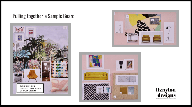
My inspiration (on the left) was packed full of moody colours and using the Christian LaCroix Bagatelle wallpaper as the jumping off point for my design. It was all about mixing the wild jungle colours with elegant finishes and textures. Of course pops of colour too.
In the last class, I pulled together lots of ideas for furniture, lighting, art and textiles. When I say lots, I went crazy. Looking back, it was a bit much. On the right is an example of how SOME of those ideas came together. You can see my obsession with the Christian LaCroix wallpaper was going strong as was my love for that hello yellow Hay sofa. A mix of contemporary and vintage pieces.
Turning ideas into practical furniture plans
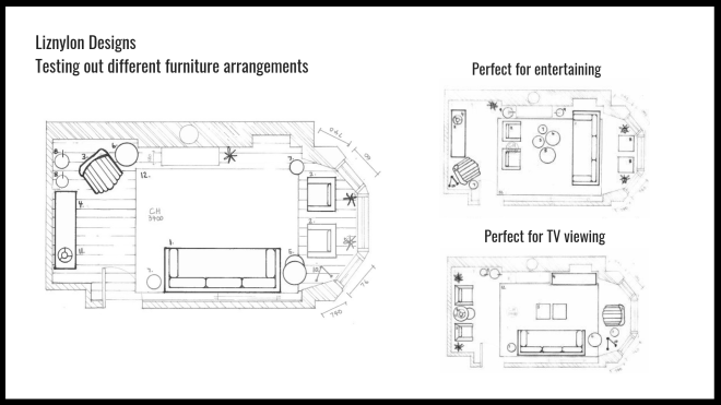
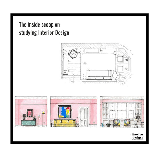
Practical. I can’t believe those words came out of my mouth. Reality strikes that rooms need to be practical. They need to be liveable. They need to meet the needs of their owners. Say what?! (eyes rolling, kidding, not). Being the geek I am, I made cut outs of the furniture (to scale) to see what would fit and what didn’t fit on the floor plan. I painfully made a pile of “yes” and “no”. That was my first edit.
The second edit was based on creating a cohesive contemporary look with clean straight lines in the main pieces of furniture with accents in black and brass. The colour palette is pulled from the wallpaper with faint soft blush walls.
The below layout provides for entertainment, kids play area, tv viewing, plenty of storage and a quiet corner for reading. This was drawn by hand and each piece of furniture reflects the actual size in the room. (aka to scale)
Goodbye black & white, hello colour
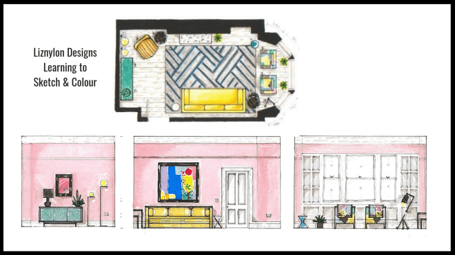
Sure the furniture fits, but what will it look like?? Before you gasp, a friendly reminder that I’m just learning to do accurate coloured renderings. This is where I MASSIVELY regretted some of my design decisions – the large contemporary original painting, the delicate fabric pattern on the custom chairs and the bold design of the rug. What was I thinking?! To recreate these by hand was painful & I’ll admit, some tears were shed too. Some of the colours are a bit too vibrant compared to the samples and you can see that while I’ve kept the beloved Adler chair, the orange colour really doesn’t work in the new design (sigh).
I have newfound respect for the brilliance of Malcom (aka Design SixtyNine) and his breathtakingly beautiful renderings. Check his Kitchen sketches here.
The nuance of creating realistic shadows, sunlit areas, textures in hardwood flooring, finer details of patterns & prints as well as weaves of fabric. My mind was blown. The amount of work that goes into each drawing is unreal. I’m hoping, praying that with practice, I’ll get quicker and better. The steps to create each of these designs by hand 1 – scale drawing of the space (floorplan or elevation); 2 – drawing each piece of furniture to scale on the space; 3 – colouring.
Where to start? Some useful tools
This is what you’ll need to get started with rendering. After many trials of coloured pencils and markers on their own, I found the combination of pro markers, coloured pencils and posca pens worked best for me. These are the items I bought & used. YES, the paper does make a big difference. (See below for a full materials list)
Learning the tricks & short cuts of design
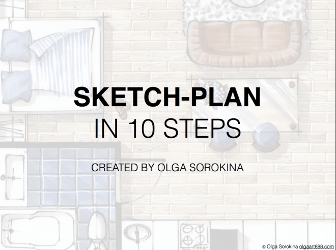
We can all use short cuts, yes? My first tip is to check out Olga Sorokina‘s website and YouTube channel. She is a master at using Promarkers for interior designs. When you sign up to her mail list, you get a free tutorial that covers the basics of shading, high lights, adding details and textures. It’s a really good “how to” guide for getting started in rendering.
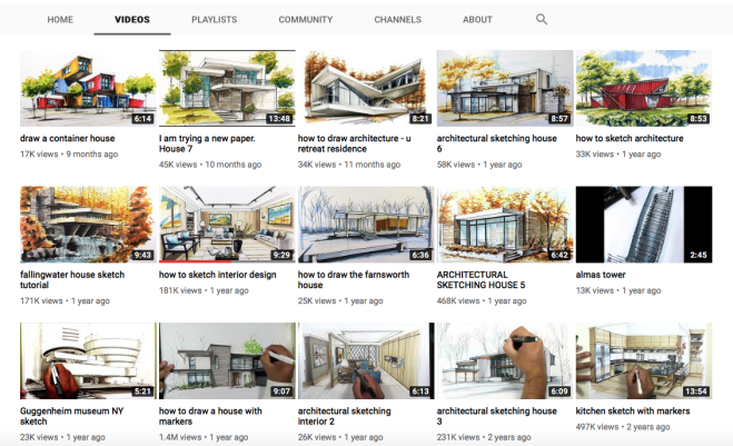
I also found Ariel Brindis sketch really helpful too. He specialises in architectural drawings and rendering using markers. I watched a bunch of his videos over & over and over again. This is where I picked up the tip of the magical white Posca pen for random touches of brightness and also some finer details of rendering art, light fixtures and items on shelves.
Time for show & tell (aka samples samples samples, singing sam-ples)
The last bit of bringing the design all together was creating a physical Sample Board – the fun bits – touching & feeling the proposed materials to be used in space. Yes, that means wallpaper sample, fabric samples, paint samples, hardwood flooring and metal accents. And yes, I actually stitched those pitiful looking miniature cushions. (please laugh with me, not at me). This all looks rather cluttered to me & I found it a real challenge to fit everything on to ONE A3 sheet. Lots of learnings for next time around.
So that’s a wrap on my design school antics. Watch my stories to have a peek into my next class, a luxury dining room for a wealthy couple. I’m always happy to answer any questions, so just send a message.
Cheers,
Liz xx
Materials list:
Winsor & Newton Promarker Student Designer 24 set – sale price £31.95
Winsor & Newton Promarker in Cool Grey 1, Cool Grey 2, Cool Grey 4, Warm Grey 2, Black – £1.99 each
Winsor & Newton Promarker Almond – sale price £1.99
Winsor & Newton Bleedproof Paper in A3 size, 70gsm – sale price £4.95
Derwent Academy Colour Pencils 24 set – £28.80
Winsor & Newton Cartridge Sketch Pad in A3 size, 110 gsm – £6.95
Posca Pens in white, silver, gold and black – sale price £7.49
White Gel Pen (not shown)
Acetate film (for blending colours), not shown


Great post, Liz. I’m just about to get started on some interior design studies so found this really useful, thank you! P.S. I’ll add some tissues to my shopping list for the inevitable tears! Victoria x
LikeLike