It’s here, I am finally able to do a BIG swanky reveal of our fresh new lounge (aka the living room). If you follow me on Instagram, you may have heard me blabber on & on about the little changes I was making to the lounge to create a big impact. Maybe you read my blog about ‘How to freshen up a living space’, click here. Drum roll, fireworks, and pop the bubbles … The big day is finally here.

So what’s this all about
The lovely folks at Comfort Works heard my endless cries about the ‘boring beige’ sofas and asked if I was interested in collaborating with them on a sponsored blog post. What does this all mean? Well, its quite simple.
We have a 2 seater Ikea Ektorp & 3 seater Ikea Ektorp – in beige. We can’t afford to buy new sofas but we CAN make them look better! Enter Comfort Works who kindly sent us replacement Ektorp sofa covers. In exchange I styled the covers, photographed it and am now writing all about how to create a fresh new look. Before you fret, these are ALL my own words and my own opinions. I didn’t have to send anything in for review or edit. 100% my own design and 100% my own words. Phew, now that we got that out of the way. Let’s jump in.
Adding more va-va-voom colour
While our space has some great period features like the fireplace, the ornate cornice, the Edinburgh press and the paneling around the windows – the room felt like a collection of things. It didn’t feel cosy and it didn’t feel pulled together. We found we were spending all our time in the kitchen and the poor lounge was being neglected.
So … we needed to up our ‘hygge’ factor … adding a colour was our solution.
Oh the colour dreams I had – would I go blue, green, pink, yellow and dare I even say it, grey? Should I get 2 different colours or keep them matchy matchy? So many decisions. I went onto the Comfort Works site and was blown away by the fabrics available and the vast colour range for the replacement sofa covers. Loads of neutrals and pops of colours. You name it, they have it – velvet, leather, wool blends, cotton, linen, heavy duty and even stripes. Go on, go over to the site & have a nosy.

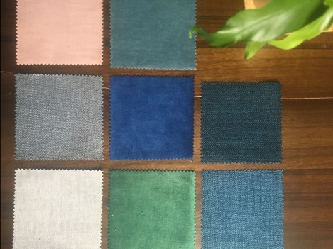
I picked 8 samples, a mix of colours and fabric types so I could get a good feel for the quality. The velvets are luxurious, the cottons are super soft and the heavy duty fabric had cool texture & colour dimension. We immediately decided we had enough grey in house and I couldn’t convince the hubby to go pink. We focused in on the blues & green.
Creating a cosy vibe with denim
When I want cosy & comfort, the first thing I grab is my fave pair of jeans. I like the versatility of denim, it can be dressed up or any easy “go to” for everyday casual. I thought it would be a perfect way to pull together all our artwork, especially the large original oil paintings and it would give us the most flexibility in mixing colours, patterns and prints on cushions. Everything goes with denim, right?!
Say hello to Kino Denim. Like your fave pair of jeans, it has depth – dark navy threads, mid blue threads mixed with lighter blue threads. love. A classic.

Going shopping in my own home
I’ll say it, after our mega renovation broke the bank, we’ve slowly been making small changes to decorate & style our home. I still haven’t won the lottery, but that’s fine, I’ve learned how to make a big impact with small changes. So where to start?
My first step was to go shopping in our own home. What do I mean? I literally stood in each room to see what art + cushions + plants + books could make the move to the lounge to create our new pulled together fresh look. This is a GREAT way to save money. What hints of blue did I already have?
I had loads of art with blue! My answer: build a gallery wall or two. eek.
I had a few books with blue! My answer: focus on the shelfie.
I had only 1 cushion with blue. My answer: add to the shopping list.
You be the judge: The before – the mid – the after
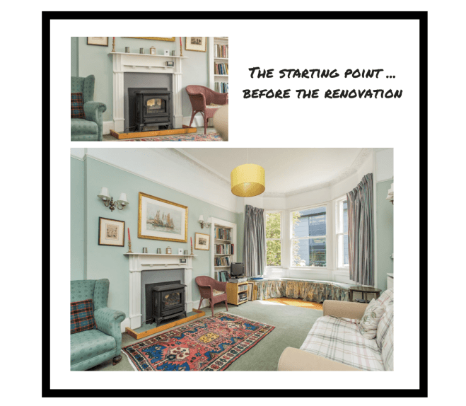
Okay, I know. You just want to see the good stuff. The before vs after. So here goes. Two years ago, this is what our home looked like. A very traditional neutral vibe lacking any real character and hiding all the beautiful period features.

Letting the period features shine after the reno
During the mega renovation, we made some bold decisions to play up the period features yet in a more modern, fresh, contemporary way. We went dark on the walls with Farrow & Ball Manor House Grey and bright All White on the woodwork. We restored the fireplace and spent nearly two years perfecting the “art lean”. The beige sofas from our rental just didn’t work in our freshly renovated home – it felt lifeless. I found myself constantly covering it up with cushions, throws, anything. It made the space feel cold and the bare walls didn’t help either.
Turning a collection of things into a colourful cosy room
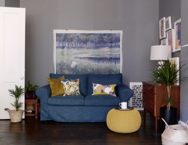
We still love all of the changes made during the mega renovation, so no paint brushes needed. This “freshen up” was all about small changes to create a big impact. It all started with the Denim sofa covers that are a perfect contrast against the dark walls and floors. It provides the everyday casual cosy warmth we needed against the formal period features. I’ll admit I was surprised. I thought the sofa covers would add more colour to the space but I didn’t expect that they would change the vibe. We are so pleased.
The art was crying out to become a Gallery Wall — the first is largely pinks & blues in white Ikea frames that fits perfectly in this nook next to the fireplace but also gives us room to add more art. These are all pieces we already owned. Nothing new. Look at how the denim in the sofa pulls out the pops of blue in the art. The jungle vibe in the Kitty McCall cushion pairs beautifully with the Leah Bartholomew and Diedododa art. This week I had made a few small changes to the mantel and returned my ‘blah blah blah’ print by Gayle Mansfield to its fave spot on the midcentury unit.
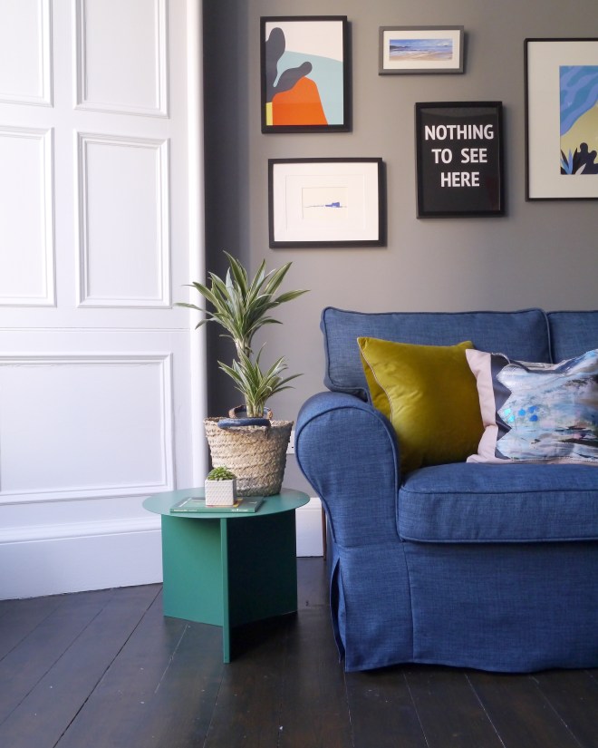
Why have one gallery wall when you can have two?! The larger gallery wall over the 3 seater sofa has more blues, greens and a very small touch of red. It is a real mix of oil paintings, ink sketches, graphic prints, photography and typography. All framed in black frames to make a bolder statement. I particularly like how the cactus photo pairs with the olive velvet cushion and pops against the Denim sofa covers. I also like how the Denim pulls the vibrant & moody blues in the Mallorca print from Room Fifty + blue ink etching by Joanna Srokol + abstract blues in cushion I made from Hatti Pattisson fabric all together. I will confess that I did buy 2 pieces of art for this gallery wall and even better news is there is space to add even more art in the future. yay.
Now you know I love a shelfie, so I could resist add some colour pop to our Edinburgh Press. Since the Manor House Grey walls are quite dark & moody, I wanted to go lighter & brighter in the shelfie. I’m always attracted to moody colours, so this was a real challenge. I pulled out the lighter blue threads in the Denim sofa covers and the perky blue sea in the Mallorca print to make my decision – Farrow & Ball Aramina wallpaper in st giles blue. I know what you are thinking, it’s autumn, this feels like summer. I don’t regret it for one second, I think it is perfect. Also, I hung the wallpaper myself. It really isn’t as hard as it looks.
Yes, this is the same shelfie and I only have one in the lounge. If you follow me on Insta, you know I’m always shifting the furniture around. I originally had the 2 seater sofa in the window but I prefer the Adler. Also you can see how I juggled the art around, some of the pieces are now up on the gallery wall. It’s all about giving things a try, living with it and then trying something new until it feels just right.
So the changes simply put — New Sofa Covers + 2 Gallery Walls + Wallpaper in the Edinburgh Press. Of course there are things that still need done but wow, what a change. Thank you Comfort Works for giving me the much needed push.

Can we talk about the details
You know I’m a total geek for packaging & labels. Well, the Comfort Works Ektorp sofa covers have labels on each piece “Hello, I belong to the seat cushion”, “Hello, I belong to the back cushion”, or “Hello, I belong to the base” Plus, it is all colour coded too. I don’t think they could make it any easier to use their covers. Plus it’s super friendly & fun.

Beyond the great design, beautiful colour, attention to detail, and fun labels. The replacement sofa covers can be thrown in the washer & dryer. It just makes life easy with a toddler running riot around the house. As much as I try to contain his snack & meal time to the kitchen, he still wanders around & is regularly found eating his rice cake & peanut butter on the sofa. Thank god, he knows what’s good for him & avoids the Adler.
So that’s a wrap on the lounge refresh and my collaboration with Comfort Works custom sofa covers. If I can create this — you can do it too! Of course there are things that still need done but wow, what a change. A big thank you Comfort Works for giving me the much needed push.

I’d love to hear your thoughts,
Cheers,
Liz xx


Wow Liz! They look great! The Denim was a perfect choice. I love seeing the before of your room aswell – what a transformation! I love all the colours here. Gorgeous x
LikeLike