
The entryway, a space ignored by many and rarely talked about. I don’t think I’ve ever heard anyone say “I love my entryway” or “Have you seen that entry?” (awkward laugh) I’m on a crusade to change that and turn the entryway into a place to be proud of.
It’s fair to say that I am obsessed with front doors and really enjoy a good nosy around the neighbourhood checking out people’s front doors. I’ve always been curious about the colours people choose, the type of hardware used, the style of windows and the sizing of their lighting. I often wonder what lies beyond those colourful doors.

Edinburgh is blessed with beautiful architecture from grand Georgian buildings with ridiculously spacious & ornate entryways to more modest Victorian entries that are packed with period features in a mere 1m x 1m space. Both of these period properties enjoy dual doors, meaning an external front door and an internal door. And both suffer from lack of proper storage. Which means double the fun & double the design opportunity.
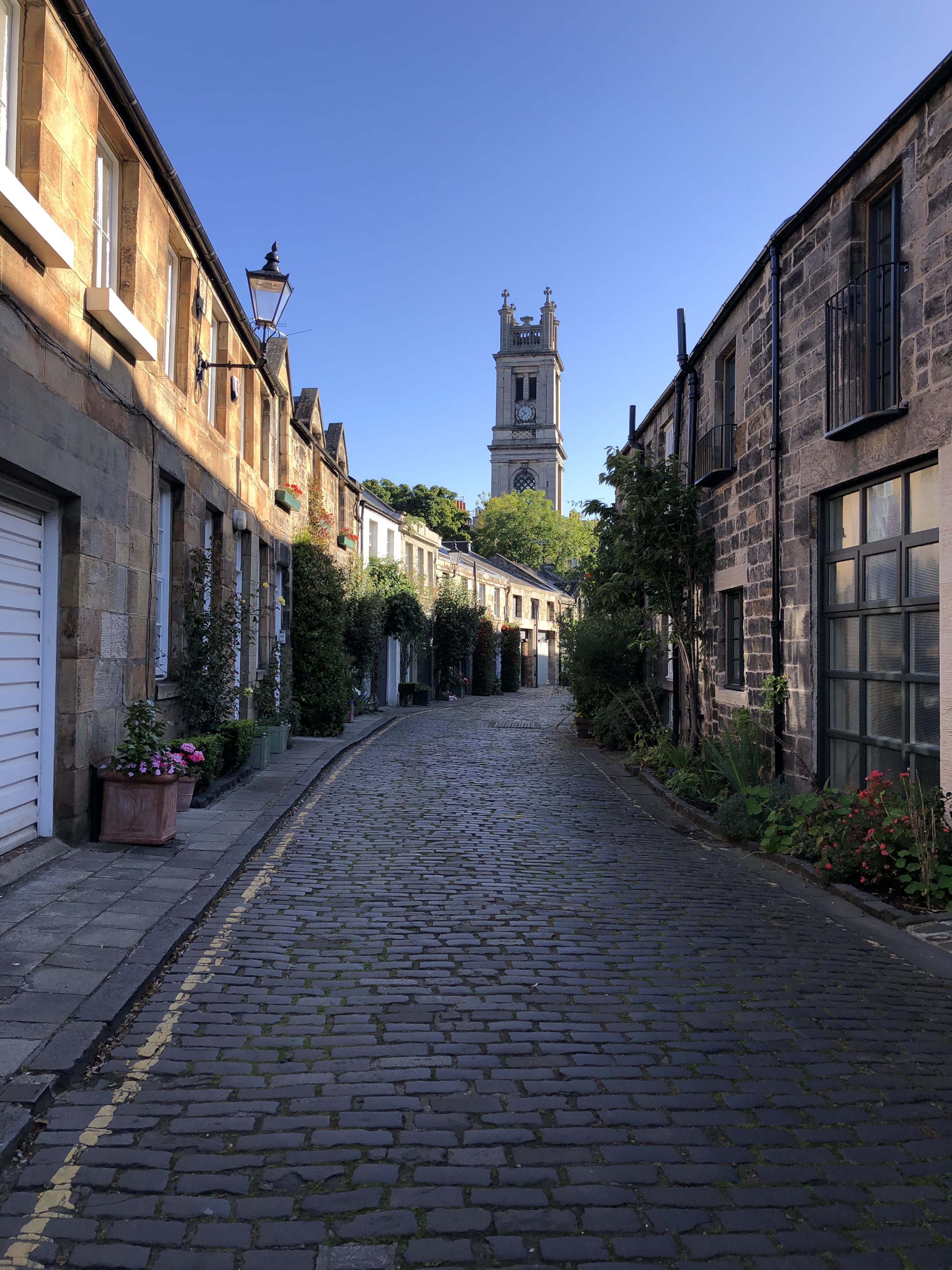
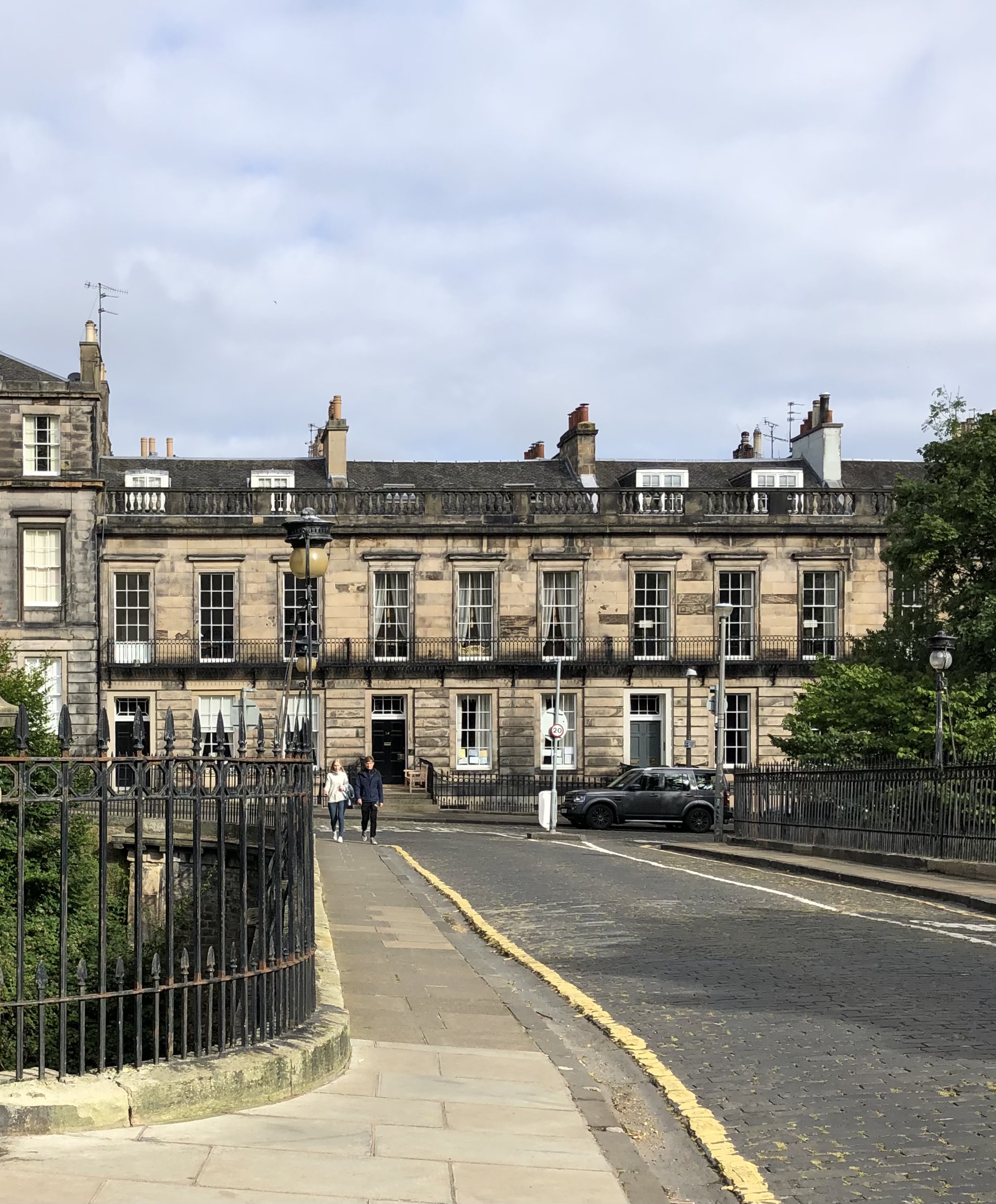
We also have sparkly fresh new builds, charming mews houses, cute cottages, bold brutalist buildings and everything in between. Whether you have a small entry or a large one, whether you have one door or two, whether you are in a period property or a new build – the largely ignored entry plays an important role in every home. It is the only chance to make a first impression, a place to warmly welcome you home and welcome friends & family (when that’s allowed again), and a place to start to reveal a bit about your home & your style. Critically, the entry needs to be functional too – a place for all those coats, shoes, school bags, dog leads and in Scotland muddy boots.
In my obsession with entryways and all those years I’ve spent stalking entryways, here are my top tips to add some character and functionality to your entryway. With each tip, I am sharing some inspiration from other designers and DIYers (links provided). I’ve also made an extensive Pinterest Board that you can view HERE. Lastly, I’ve tried to share examples that are space challenged as these can be a bit tricker to envision. I’ll also give you a peek at what’s happening at my house.
Tip 1: Panelling
Where there are few features, think about adding depth & interest with panelling. Think about which style best reflects the style of your home, then layer on a bench, hooks or shelves for functionality. Using single planks horizontally and vertically is a great way to create a contemporary look.

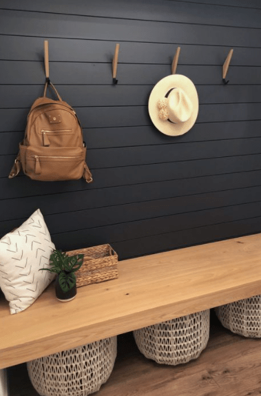
ANewDay Design Studio has created an entirely bespoke and seriously stylish nook that includes hidden storage, a cute seat and hooks. Finsihing it off in a bold colour and custom cushion makes it truly original. Urban Oakes Design has run planks horizontally to mimic a shiplap design and by painting it off-black and pairing with a natural wood bench & baskets is a contemporary take on boho. This space is actually a mudroom, so a bit larger than an entry.

Other designers have opted for a more classical or traditional style with panelling. This can be created by using a rectangle layout typically found in Georgian, Victorian and Edwardian homes. Mark Lewis Interior Design has created an entry full of drama in this lush rich blue and panelling that looks as if it could be an original feature. Jessica Sara Morris of White Picket Farm House is known for her clever DIY and upcycling projects in her 1970’s home. She has used a few different types of panelling to add character throughout her house and in the entry she uses board & batting on the lower half of the wall (aka wainscoting).
Tip 2: Colour Blocking
When a proper entry doesn’t exist, a really affordable way to create a dedicated space is by using paint. Go simple with a single colour or get creative with a series of colour blocks to make a style statement. Think about how the colours will link with the rest of your home or boldly contrast it.
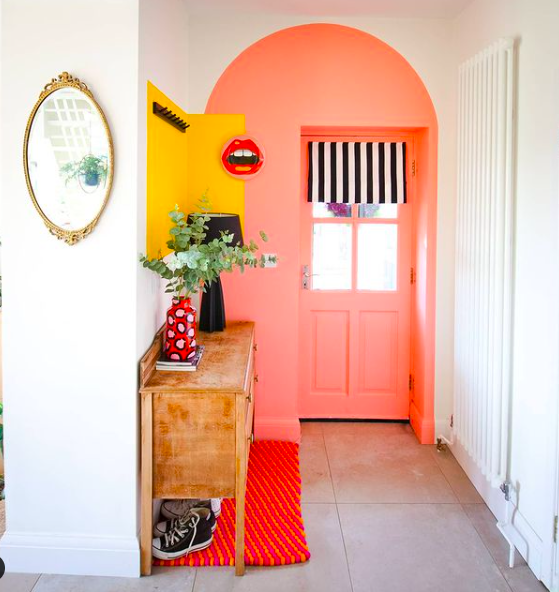
Lissi of OxfordOne is best known for her colourful home and fun DIY projects, here she’s turned a bland entry into a bright colourful space that just makes you smile. You can find these colours and shapes in other rooms in her house which pulls it all together. La Maison d’Emilie, a french photographer, has used a singular colour for maximum impact in this petite entry. Tip: Use a more durable paint finish (eggshell) to minimise chipping, scratches and wear in the areas with the highest use (like walls with hooks).
Tip 3: Layering
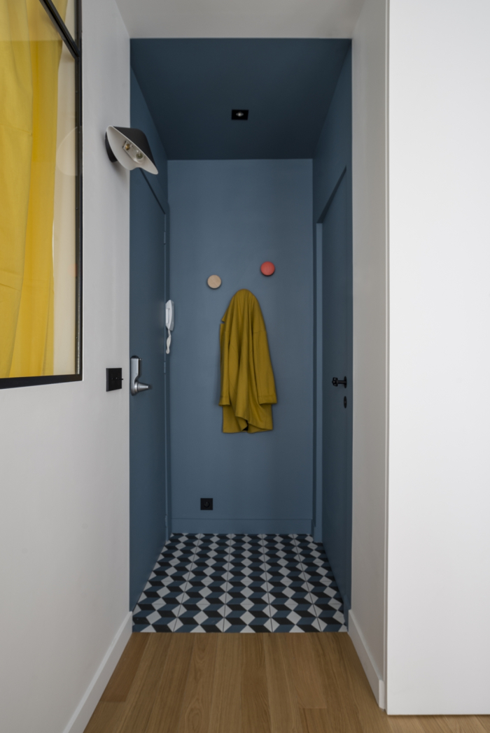
Create a memorable wow moment at the first step in your front door by layering on textures, colours, patterns with paint, wallpaper, fabrics, tiles and artwork. Think about how you balance each aspect: primary colour vs accent colours, bold patterns vs delicate prints, and how the walls + ceilings + floors+lighting all come together to make a statement.
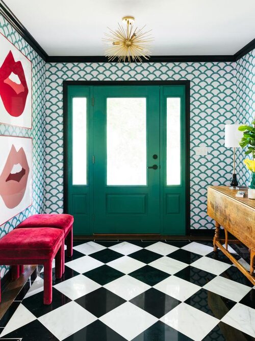
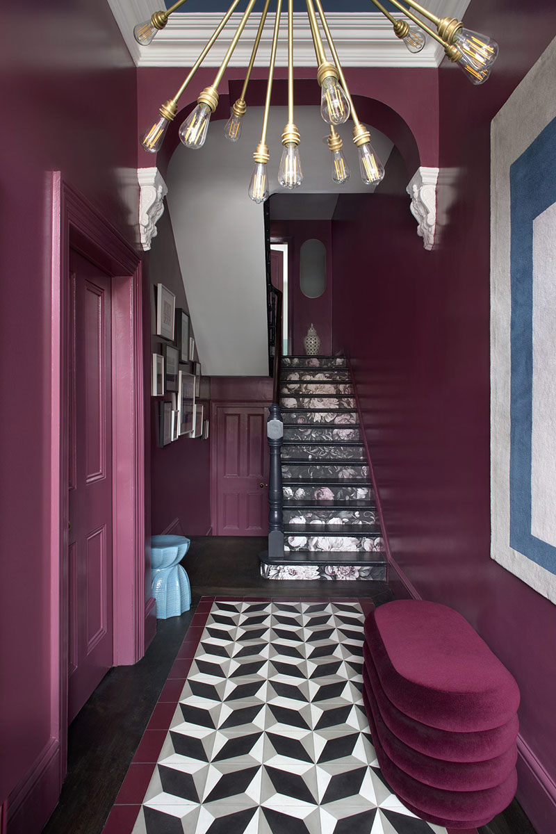
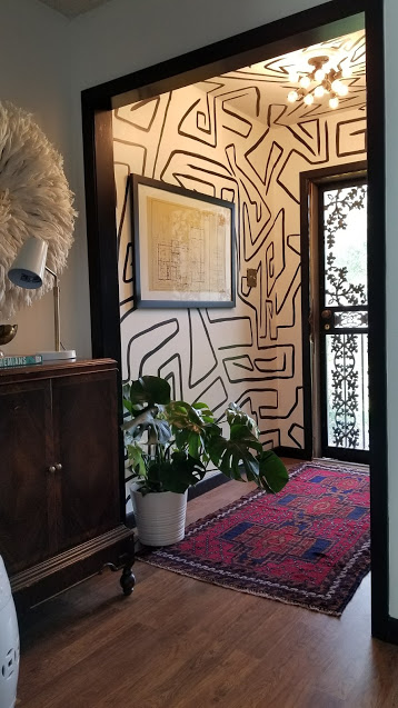
I’m a big fan of layering and of bright pattern filled entry created by Interior Design firm The Rath Project. The colour palette is largely monochrome with pops of green and red which allows the scallop and supersized checker floor to wow. Award winning Kingston Lafferty Design has flooded the entry with a vibrant colour that is bold & brave. The floral wallpaper on the stair rises is an unexpected touch and lures you into the property while the tiles define the entry space. Interior Designer Carmeon Hamilton of Nubi Interiors (named a rising star by Architectural Digest) designed this artistic vintage entry that seamlessly unites a handpainted abstract wall & ceiling mural (seriously cool) with an oriental vintage rug and a unit from her great grandmother. Add art, plants and accessories – she always makes it look so simple.Bonus tip: use polyvine decorators varnish over wallpaper in an entry to give it an extra layer of protection (especially if you live in a particularly rainy locale or have messy kids/pets).
Tip 4: Clever Storage
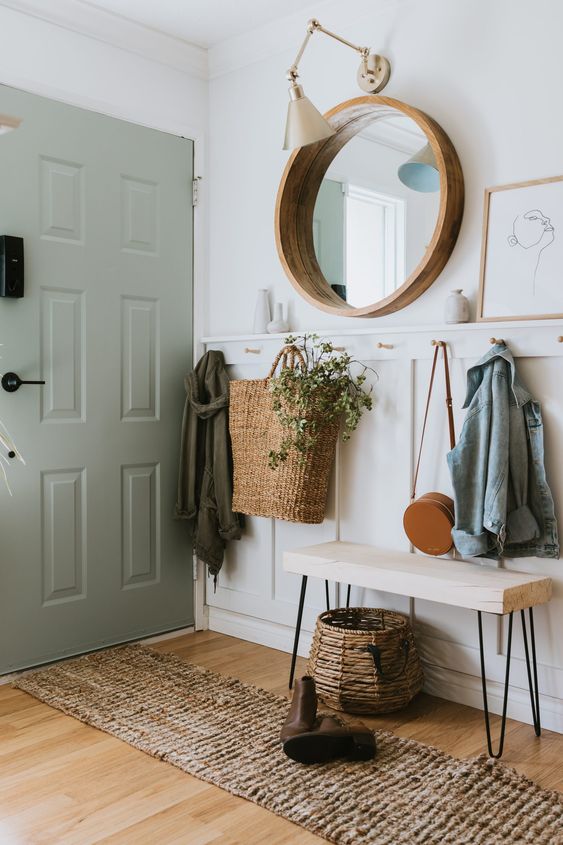
It’s a fact that a well thought out entryway storage can help make the morning routine smoother and less stressful, especially if you have kids and/or pets. These designers have shown us that functionality and storage doesn’t need to be boring, the below examples are clever, creative and perfectly blend form & function together. Think about what you use daily and those essential items that need to bee stored at arms reach vs items that can be stored elsewhere in your home. Think hooks, baskets, drawers and shelves.

This beautiful entry is in a property that is for sale with Entrance in Sweden. Yes, the wallpaper is stunning, but equally is the thoughtful design of shelves for shoes, baskets for scarves, a rail for coats. This takes shelfie to a whole new level.
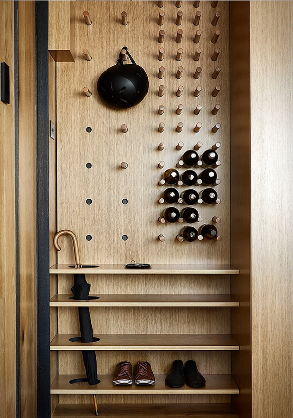

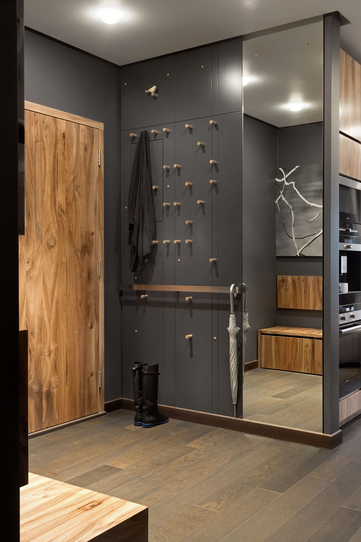
The next two examples have also thought carefully about the most critical items that need storing by the entry and who knew pegs could be so sexy? From pegs for wine bottles to shelves for shoes and special area for umbrellas and helmets – this refined and elegant storage idea by Tsai Design seen in Planete Deco is for contemporary living and completely adjustable. A more urban interpretation is the black peg board with hanging bikes and plants was featured in Architectural Digest and has inspired me.
Tip 5: Play up Features
Some homes are blessed with an abundance of characterful features in their entryways with original tiles, panelled doors and walls, ornate cornices and oh la la lighting that may date back 100+ years. If you have period features, think about making the original features the focal point and let them shine. What can you do to preserve, enhance and elevate those features vs fight against them or even worse destroy them. These designers have done just that.


Brooklyn based Hayley Moynihan who manages renovation projects in NYC, restored many of the features her stunning entryway including the stained glass transom window above the door. She added the punchy pineapple regent wallpaper that echoes the 100 year history of her property. I’ve always admired how Farrow & Ball colour consultant Siobhan McFadden (aka @home__stead) elevates the period features in her home. Here she pairs a delicate wallpaper by William Morris with F&B Studio Green on the woodwork. Globally recognised design firm Les Ensembliers are known for creating luxurious spaces and this is certainly the case. The glossy black paint used on the doors and paneling is a grand statement and the nature wallpaper balances perfectly with the floral stained glass door and transom window.
Tip 6: It’s all in the Details
Sometimes a collection of small details can make the biggest impact and the biggest statement. Think about how each individual piece works together to create a look. New builds and full renos have a great opportunity to create something magical by focusing on the details. These designers have used mirrors, task and ambient lighting, hooks, wood, finishes and even the switches to carve out a sophisticated welcoming entry that is functional too.

The above inspiration can be found on my Pinterest board with many others. I am having difficulty tracking down the original sources. One was featured on Behance and another on Bodes Studio in Russia. Let me know if you know the owners or designers.
Getting started on revamping my entryway
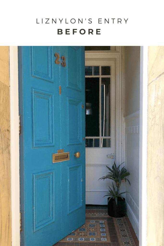
I hope you’ve found these tips helpful and the examples packed full of inspiration. Some of you might know that I’ve been revamping my own entryway. We’ve been in our period property for four years and the bland entryway doesn’t relfect the rest of our home. It also wasn’t functioning for us as storage was non existant. We first had to fix some damage and then our main focus was to celebrate the original features while injecting a more colourful and contemporary vibe to mirror our home.
What to do when you hate the colours of a key feature in your home?
As you can image, I debated colours and wallpapers for quite some time. One thing that was staying put was the victorian tiles that have graced our home for 100+ years and I have to admit that the colour palette of deep dark rusty red, muddy dark brown and warm beigey-yellows found in these tiles was about as far as you can get from my preferred colour palette. Yikes. So what do you do when you have a colour palette that dare I say, you absolutely loathe?


Think about colours that compliment the colour palette and colours that contrast the colour palette. To compliment the colour in the tiles, I could have gone for a dusty blush or a lighter shade of rust or I could have gone down the mustard to beige route as shown on the colour cards here. Or, I could boldly contrast the colours in the tiles, yet stay with familiar pairings that existed in the same time period.
What did I do? I used Scotland and Edinburgh as my jumping off point, however I wanted to create a fresh take on Heritage. Drumroll ….. here is the big idea for my entryway moodboard ‘Abstract Heritage’.
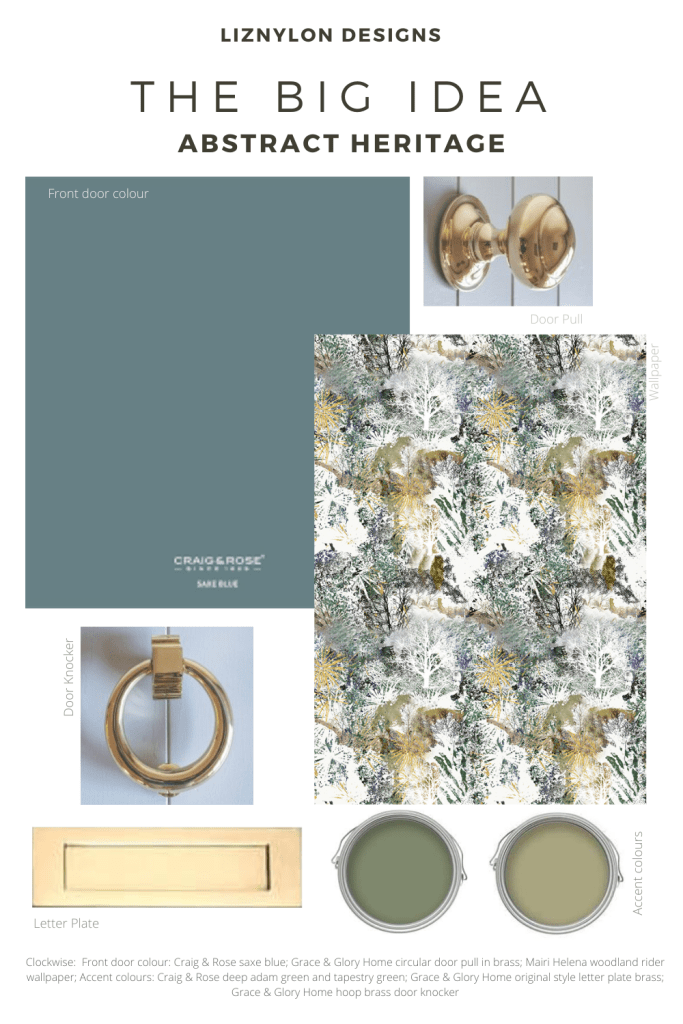
Decisions. Decisions. I turned to Craig & Rose paint brand as it was originally founded in Edinburgh in 1829, which is the around the same time my flat was built. While I was desperate to go bold & wild on the front door, it just didn’t feel appropriate to our property. So I used the blue in the tiles as my linking point. After testing a few options, the winner was Craig & Rose Saxe Blue. It feels luxe with hints of green and grey.

I then focused on the all important front door hardware that would echo the grandeur and elegance of Edinburgh. I turned to a brand I trust Grace & Glory Home. I’ve always lusted after their british made hardware and their products are really well made. I was tempted to go bold & wild, again it just didn’t feel right. I opted for the original style brass letter plate, the circular brass door pull and the hoop brass door knocker. There are so many hardware brands & from a past bad experience with quality, I knew what to look out for. First, all of the Grace & Glory Home products are made of solid brass, they are made in a British foundry and in small batches. yes. yes. yes. These three things meant the quality be amazing and I could be confident that it would look luxurious too. The other feature that won me over was type of brass, it is “unlacquered brass” so it would age naturally over the years and have a beautiful patina. BUT if I wanted to shine it up, it would just need a polish. So the best of both worlds.
Looking inside at the very petite 1m x 1m entryway between our front door and our internal door is where I decided to be a bit more bold in my choices. Mairi Helena‘s Woodland Rider abstract wallpaper was the inspiration. All of her wallpapers are inspired by the Scottish countryside and her breathtaking photographs. If you look closely at the abstract wallpaper, you can spot trees & leaves but can you spot a horse and rider galloping by? I fell in love with the abstract design and the brilliant colours. I then continued to be bold and paired it with Craig & Rose Deep Adam Green and Tapestry Green, both from the 1829 collection and a contrast to the deep rust in the tiles.
So there you have it. In the coming weeks, I’ll share more ideas for front doors and entryways, including my top picks of hardware, some entryway looks, the full reveal of my entry and a * NEW SERVICE * that I will be launching. So watch this space closely.
As always, thanks for reading. All the words & moodboard are my own designs. Note: I approached Grace & Glory Home to collaborate with me on the entryway revamp and they kindly gifted three products. All of the descriptions and views are my own. I’m eager to hear your thoughts, comments, questions and ideas. So please leave a comment below or send me a DM.
Cheers,
Liz xx

3 Comments