Yes, you read that title correctly. This entire blog post all about how a single item of clothing can inspire an entire room look. Ever see something and think that would make an amazing bathroom wallpaper or sofa fabric? What about designing an entire room around a dress? Is that reckless? I can admit that I’ve thought about it quite a few times. Now, it could be I’m just a big interiors geek – or – maybe just maybe you have thought the same thing?
Do you have a clear picture of your interior style? As part of my interior design studies this is something I think about a lot. Trying to help people describe their “style”, what they find inspiring, what brings them happiness and the mood/vibe they are searching for. Stick with me. One place we can start is by looking at our wardrobes. You’ve probably heard a number of designers and instagrammers talk about looking inside our closets for “clues” and “inspo” on defining a style. A quick scroll through Instagram #whatIwear and #Dresslikeyourhome you can see how others personal style resembles their interior style.
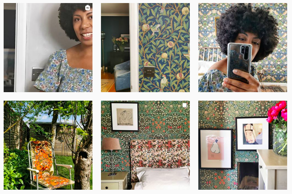
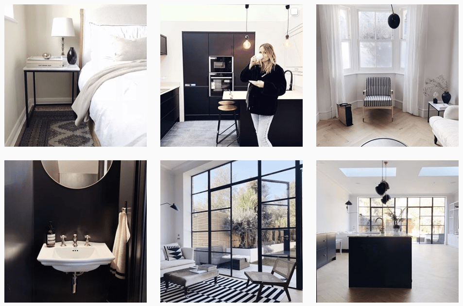
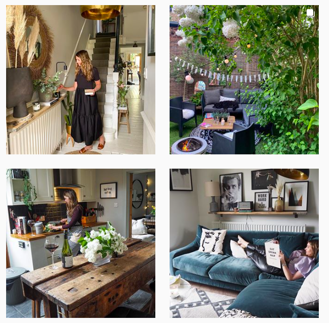
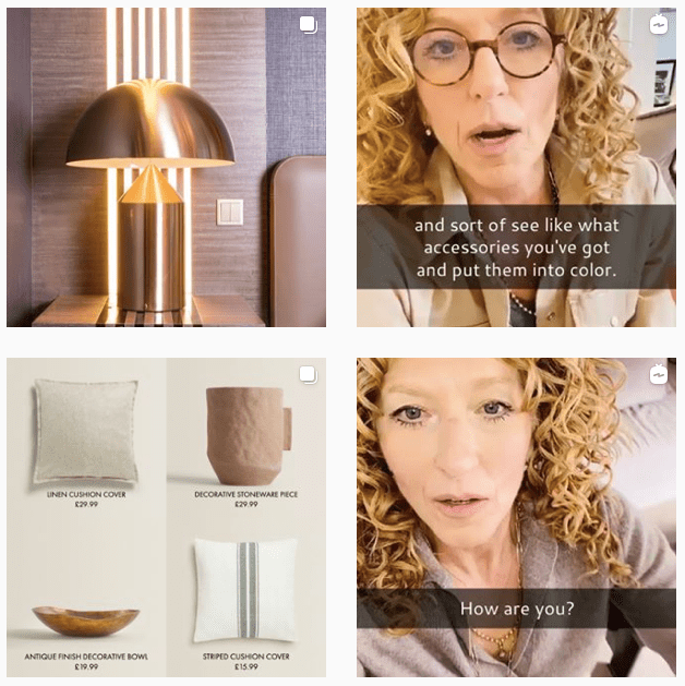
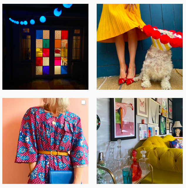
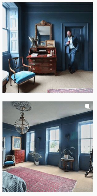
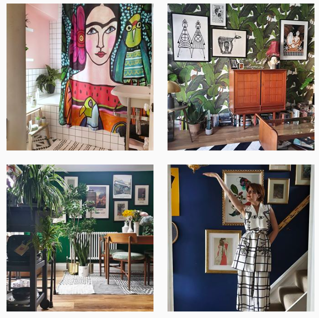
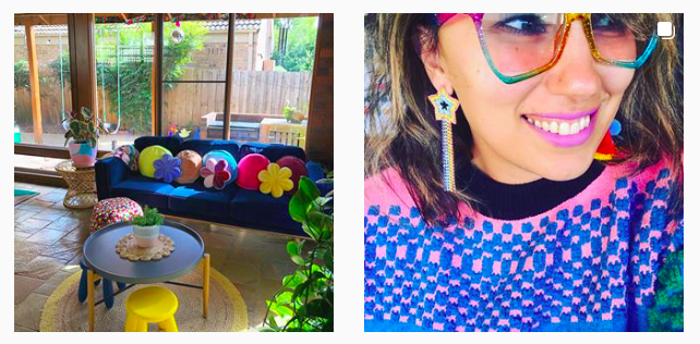
Follow these inspirational accounts here: Romanic florals with @nofeaturewalls; Sophisticated monochrome with @Pebbles_and_Peanuts; Relaxed boho with @Kerrylockwood; Contemporary neutrals with @Kellyhoppen; Colour contrasts with @aproudhome; Tradationally classic with @manwithahammer; Pattern maximalist with @almost_everything_off_ebay; Rule breaker @thecolourtribe
From these examples, its easy to see how our wardrobes can give us some great “clues” to creating our very own unique interior style. Here are a few ideas of where and how to get started.
1 – Colour inspiration
Let’s start with the most basic “clue” from our wardrobes, colour or lack of. Is your thing neutrals? Monochrome? Bold colours? Soft pastels? A single colour or a few? Think about why.
Does monochrome make it easy to mix & match items? Does a certain colour make us feel confident or energised? Do we use neutral so our accessories pop? Or perhaps we love the idea of layering neutrals to feel cosy and relaxed? That was a lot of questions. Of course it is more complex than this, but the colours in our closet could be a “clue” to colours that could work in our homes.
2 – Ideas for colour pairings
Which of these feels true to your fashion style:
This is where our wardrobes can be the best “clue” because the designer already did the hard work of figuring out what works with what. Yaye.
Warning: I’m going to geek out for a moment. For interiors, if you are looking for some other “clues”, you can turn to wallpaper (what colours have been used together) or paint companies. Both normally suggest colours that work well together and most have inspiration areas on their websites. You can also grab yourself a colour wheel. Here are some basics:
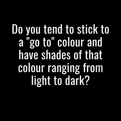
Monochrome: No, it isn’t black & white. It’s using a single colour and going light or dark in that colour. An example of this Paint & Paper Library Architecture colours – Plaster II, Plaster IV, and Wallpaper in Plaster to create a unified look. Another example is Little Greene Paint using extremes of green – light Acorn green paired with a dark Hopper green.
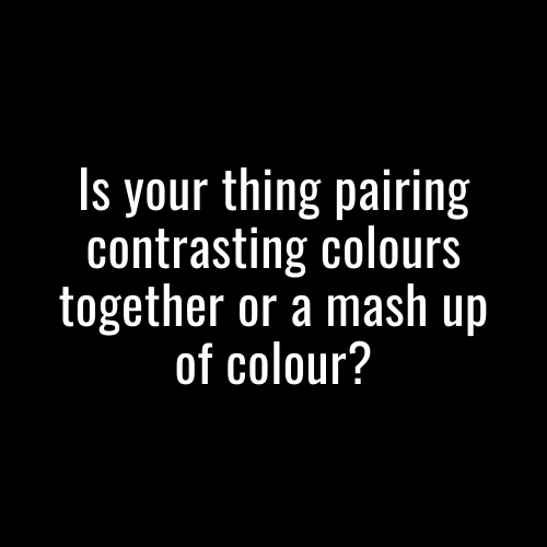
Harmony: These are colours that just work together because they sit side by side on the colour wheel and are “natural partners”. An example of this Designers Guild pairing of orange, red and a peachy blush in their Earth Tones moodboard. Also, Claybrook Studio shows how blues and greens naturally work together.
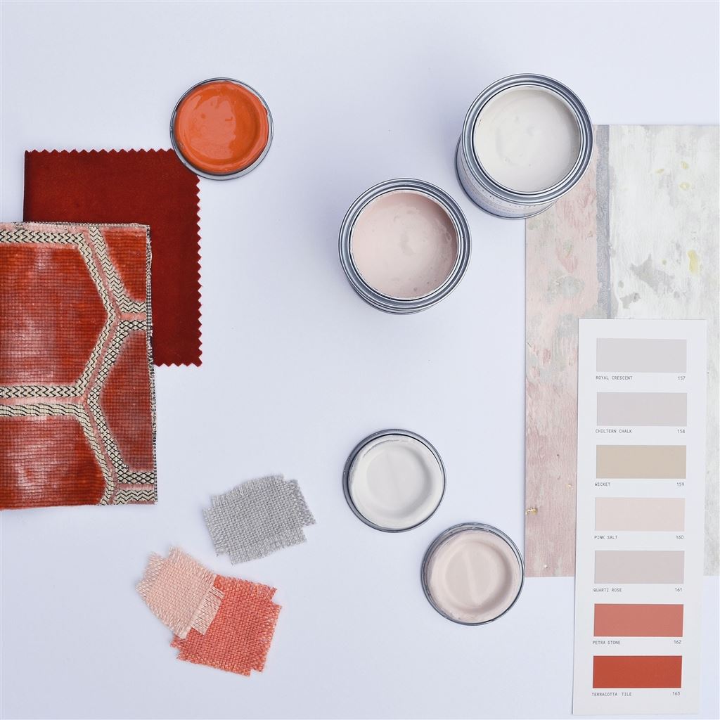

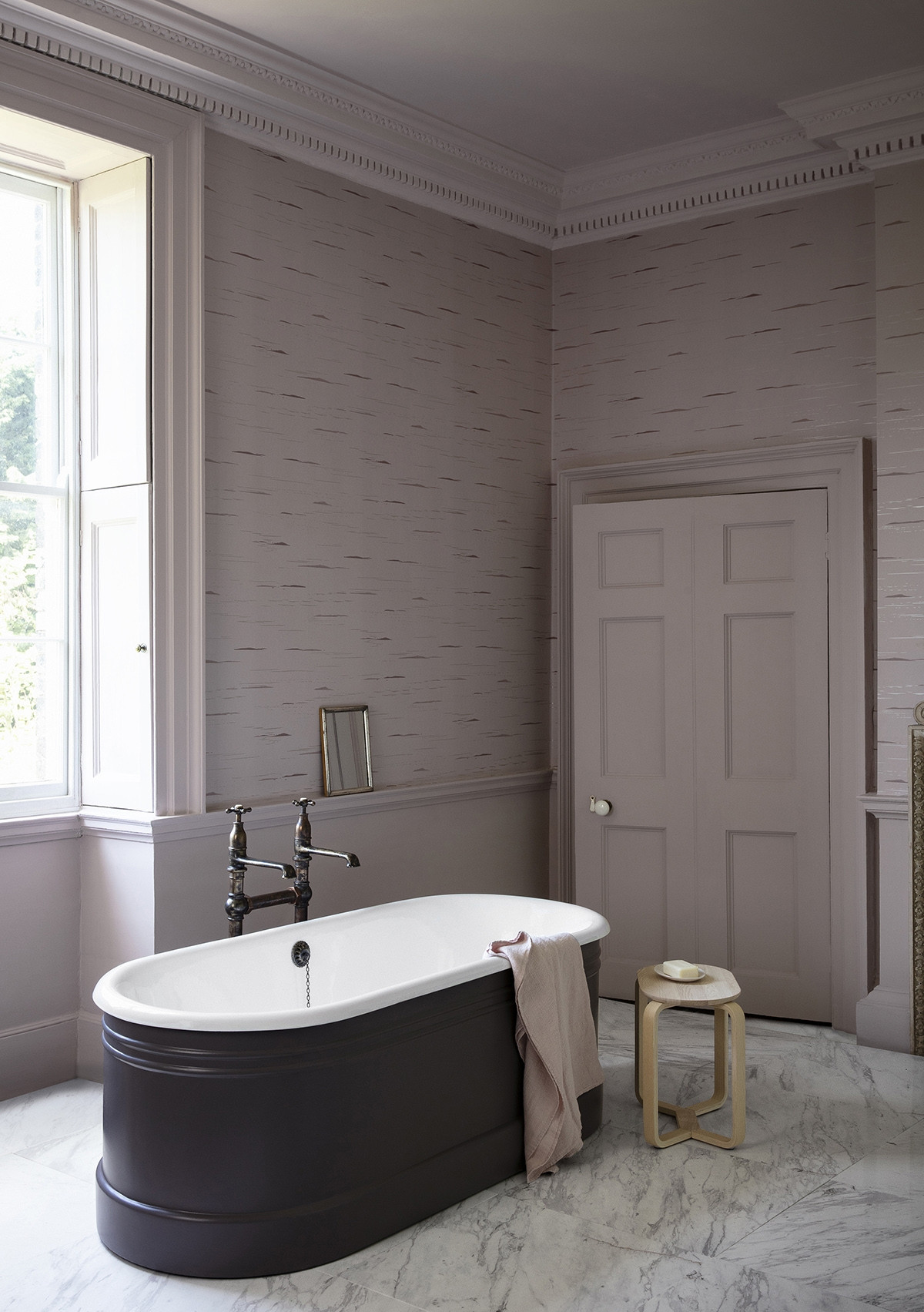
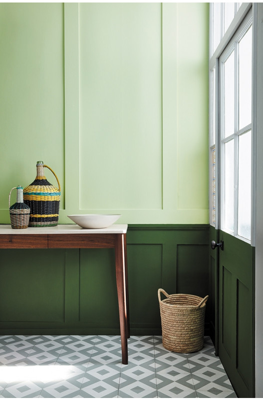
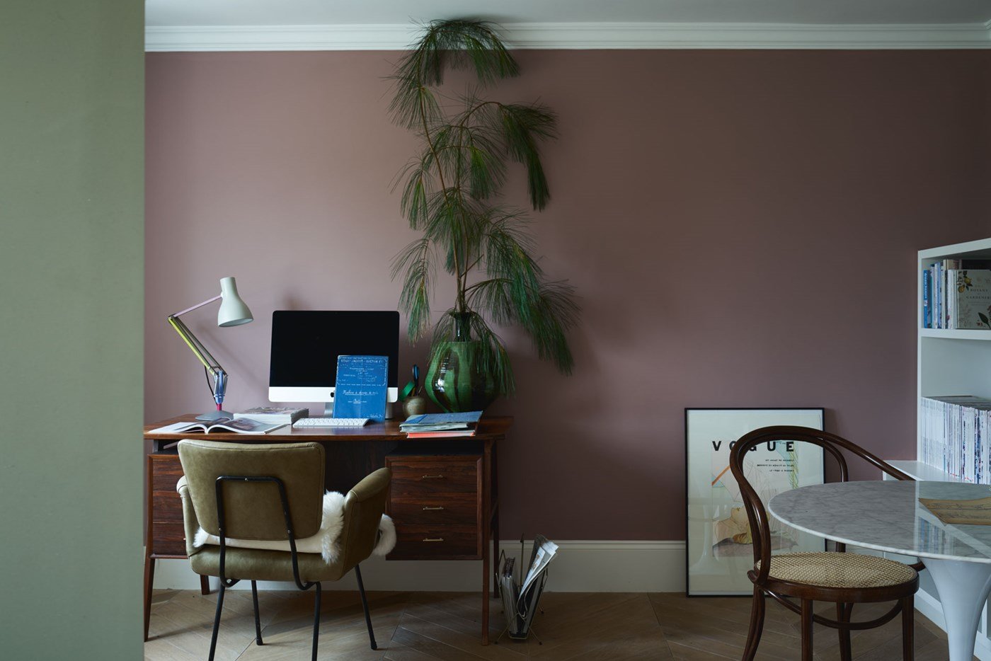
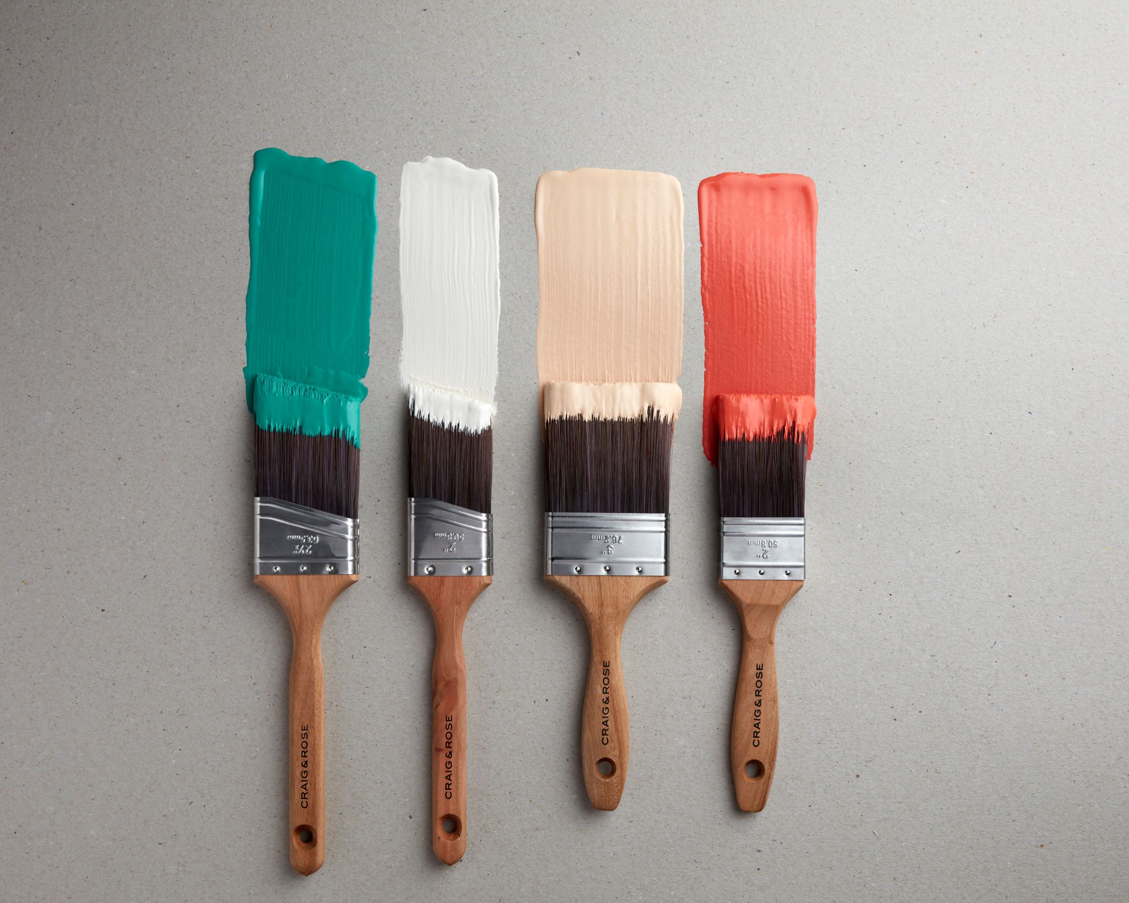
Contrast: The saying is true – opposites attract. It is true when it comes to colours too. An example of this is Farrow & Ball pairing Sulking Room pink with Treron green in this home office. Another example is Craig & Rose pairing their new colours Fleurie green with opposing Troubadour deep coral with neutrals soft peachy Chatelaine and Regency white.
If you are fascinated by colour and the psychology behind colours, have a read of “The Little Book of Colour – How to Use the Psychology of Colour to Transform Your Life” by Karen Haller. It is packed full of the hidden meaning behind colour, the moods colours evoke and a few different quizes to identify your colour style.
3 – Pattern inspiration
Florals. Stripes. Abstracts. Botanical. Animal. Geometric. Dots. Flecks. Herringbone. The options are endless. Our wardrobes can be the perfect “clue” for patterns that we are naturally drawn to. Go on, have a look at your wardrobe, what “clues” can you find?
I’m a huge lover of patterns, however looking at my wardrobe, one thing you won’t find is florals. Walk around my home and guess what? You won’t find a single floral print either. Sure, I have lots of botanical leaves but no floral prints. That’s a big clue I shouldn’t ignore.
4 – Ideas for scale and vibe
I’m calling this “clue” scale and style as it is mixture of looking at the scale of the patterns and also the general vibe. Looking closely at the patterns in our wardrobes, are they Delicate or Bold? Are they full bleed or are they placed on a neutral? Is the pattern outlined or vibrant? This is a great “clue” for our home and how to use patterns. The other “clue” our wardrobe gives us is our general “vibe” are you casual or structured, romantic or modern, hipster or sporty, classic or trendy, minimalist or maximalist, etc.
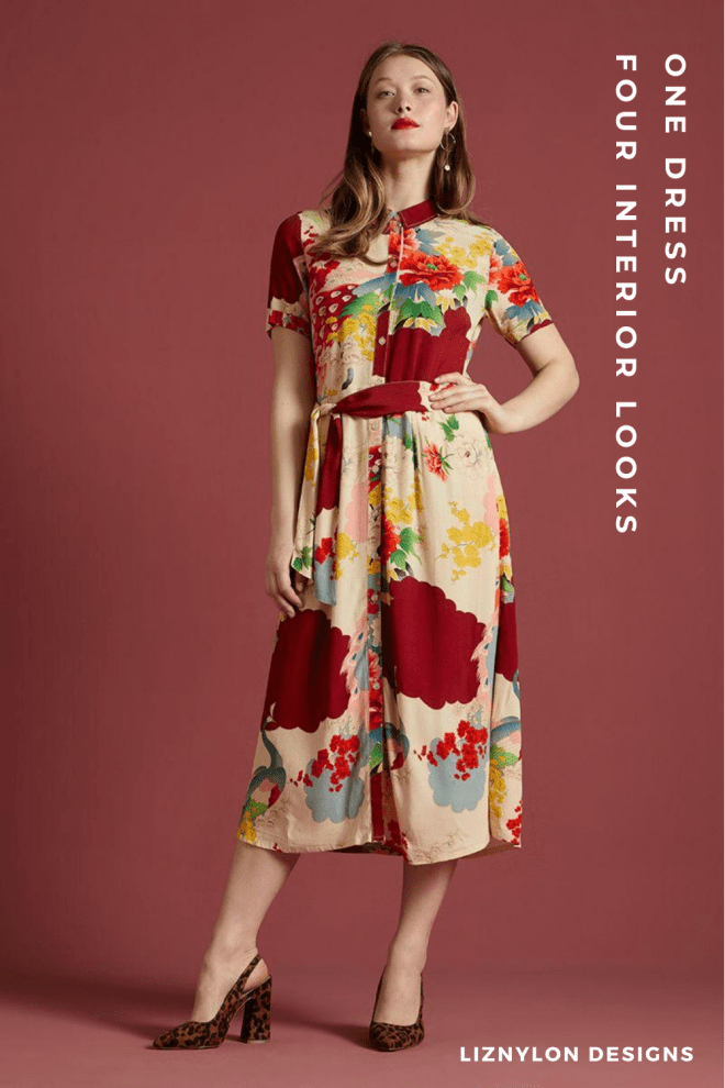
One Dress, Four Looks
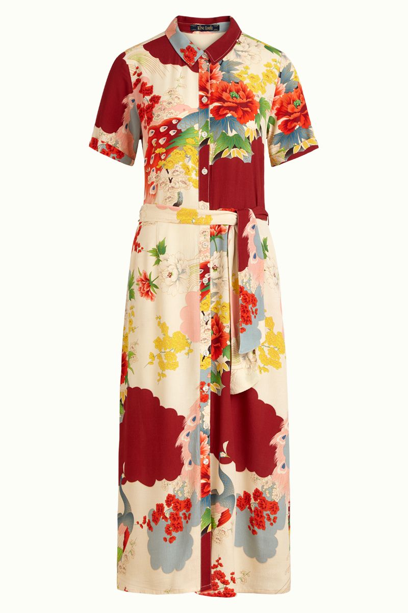
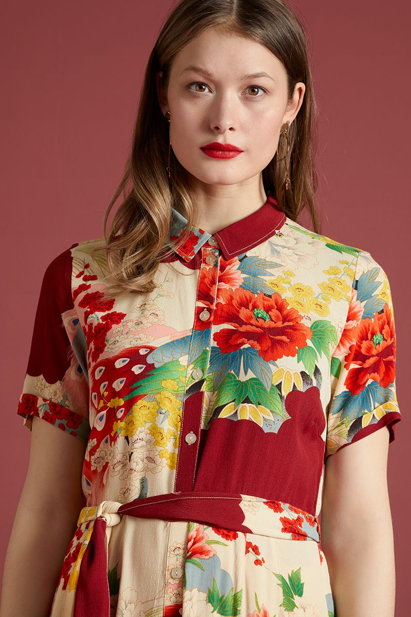
So, let’s dive in! Last week, I saw a post by @Indie_edinburgh of the Rosie Sesame Midi Dress (available here) and instantly thought the dress would be perfect inspiration for a great room design. Here are a few looks I’ve pulled together.
Look 1: Midcentury Modern Time for Cocktails
Inspired by colour and vibe: The most dominant colour in the dress is Rust and the general vibe is Retro. These are the “clues” I used to create this sophisticated adults only look with a paired back midcentury vibe.
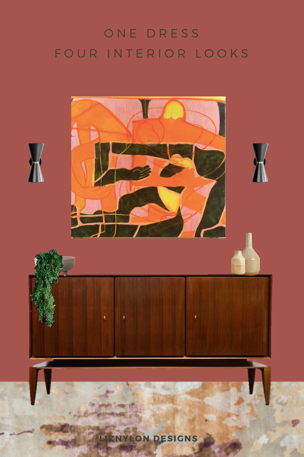
Craig & Rose Red Barn wall paint; Amy Kent Painterly Rug; Tahnee Lonsdale ‘Four in a Bed’ original oil paintinging on canvas 70 x 64″; 1st Dibs rare Gio Ponti vintage mid-century cabinet; Made dot com Ogilvy wall lamps; Zara Home ceramic and contrast vases.
Look 2: The Abstract Floral Romantic Bedroom
Inspired by pattern and scale: The whimsical paint brush strokes and the extra large floral motif on the dress are the pattern and scale “clues” I used to create this romantic playful look. While the colour palette differs, the background brush strokes and the enlarged florals in the wallpaper is how I interpreted the dress into an interior look.
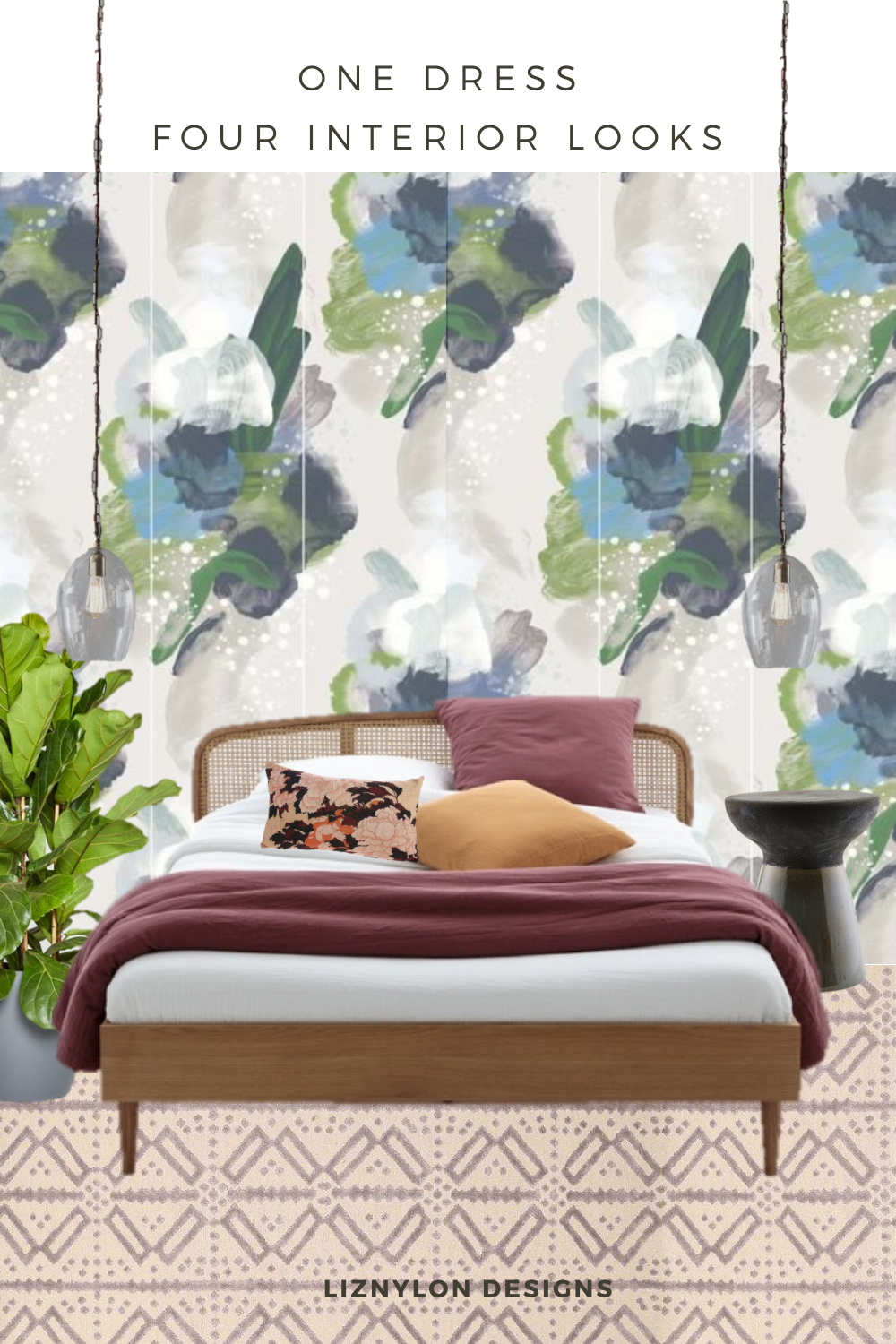
Feathr English Rose wallpaper; LaRedoute rattan bed; A Rum Fellow Poxte Castor rug; House Doctor stool available at IamNomad; Pooky Priscilla pendant lamps; HK Living Floral cushion; Patch plants Fiddle Leaf.
Look 3: The Rebel Artistic Living Room
Inspired by the colour pairing: The use of two primary and opposing colours (rust and blue) are the main “clues” I used to create this strikingly creative and bold look. The use lighter and deeper shades of blue as seen in the wallpaper and the pairing of rust and blush in the artwork and sofa, demonstrate how opposites work together.
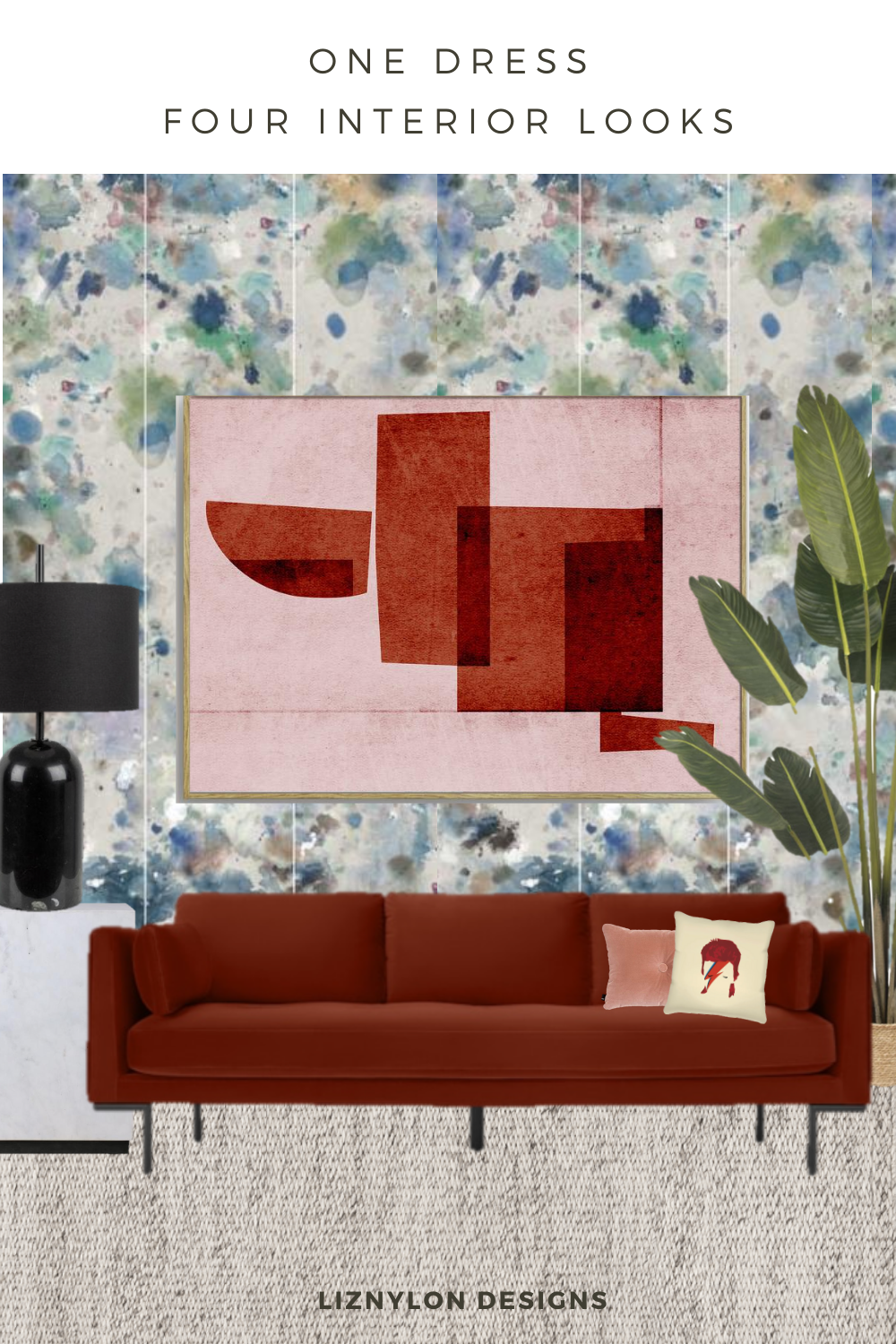
Made dot com Harlow velvet sofa; Feather Kiki Slater Dreamboat wallpaper; Formworks Studio Landscape 2 painting; Heals Manhattan black table lamp; White Marble block table from IamNomad; Patch Plants Howard; Bowie cushion on Trouva; Hay button cushion; NordicKnots Dunes Melange Rug.
Look 4: The Cosy Boho Reading Corner
Inspired by colour pairings and scale: The dress was full of vibrant and soft colours that balanced nicely off of one another so this was a big “clue” for creating this cosy relaxed look. Beige. Rust. Pale Blue. And just a very small accent of yellow and green. Another clue was the boldness of the florals. The dress is largely a neutral backdrop of beige that allows the florals to “pop” and grab all the attention, which I’ve done in creating this relaxed boho vibe.
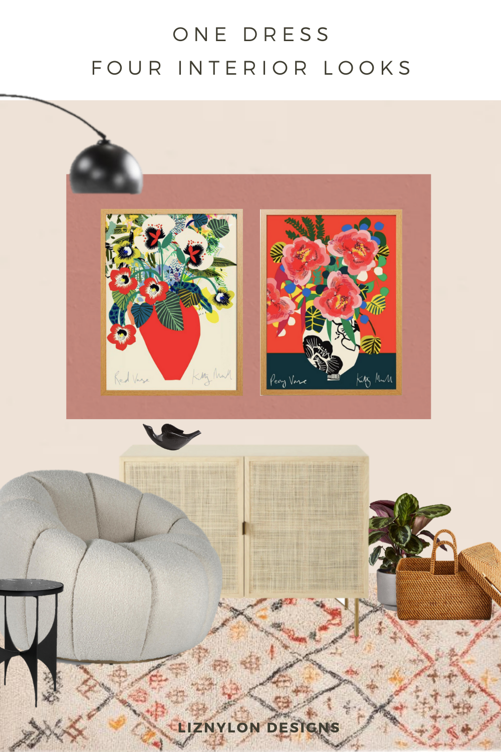
Lick paint pink1 wall colour; Lick paint red3 accent colour; Kitty McCall Peony fine art print and Red Vase fine art print; Soho Home Garret Chair; Soho Home Swift side table; Maisons du Monde woven rattan cabinet; LaRedoute Ashwin Berber AMPM Rug; Zara Home rattan basket; Made dot com Bow black floor lamp; Jonathan Adler flying bird bowl.
So tell me, what are your thoughts? Does your home resemble your wardrobe? Do you see the connections? Which of the four room looks do you feel is the best translation of the dress — cast your vote over on my Instagram:
Look 1: Sophisticated Midcentury – Look 2: Romantic Florals – Look 3 Artistic Rebel – Look 4 Cosy Boho
Hope you’ve enjoyed this post and I’m looking forward to how you have translated your personal style into your interior style. A big thank you to Indie Edinburgh for providing the brilliant dress inspiration, check out their instagram here.
Cheers
Liz
